Our final product at the end of A2 Media will be a 5 minute short film. My blog will document the work and evidence that is needed for our film to be as successful as possible.
Friday, 6 May 2011
Thursday, 5 May 2011
Friday, 29 April 2011
Evaluation Q4:
For this question we will be posting various images and screen captures of the new technologies we used, including softwares and evaluating there usefulness and how they contributed to our project. We will be explaining what we used them for and the reasons why we felt they were the best for the task we chose them to do.
After we did this, it became clear that without the new technologies making our film would have been a lot harder than it already was. All the technologies together enabled us to make a film that looks proffessional and effectively targets our intended audience.
Thursday, 28 April 2011
The Equipment Question 4
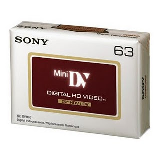
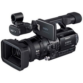
Cassettes are almost obsolete in the film industry as hard disk drive has taken over; but the is a disadvantage to this as work can be lost this way and there is no hard copy like there is with a cassette tape.
an advantage of using a tape is that you will always have the original footage, some it can be part of an archive; if any work was to be lost you can always use the raw footage as you will have it all recored on tape.
Final draft AV 2.5 Question 4
The Final Draft AV 2.5 screenwriting software from final draft is a screenwriting suite designed specifically for screenwriters. The software allows you to work in a two-column workflow, featuring a dedicated channel for video and another for audio. Since it is designed for screenwriters, Final Draft AV will automatically keep these columns aligned correctly when text is added or deleted from either one. This is an excellent tool for anyone writing scripts that require separate audio and video columns. We used Final draft av to write the script for our film, having the separate audio and video columns are useful as the script flows better and is easily read for us as the creators and for our actors to learn.
Storyboard Quick 5 Question 4

Storyboards are graphic organisers as a series of illustrations or images displayed in a sequence for the purpose of pre- visualising a motion picture, animation, motion graphic or interactive media sequence, including website interactivity. Storyboard Quick 5 is a storyboarding software application for creating and editing digital storyboards. used primarily in the film and TV industry by film directors, producers, writers, it is used to produce a visual layout of media projects for communicating with crews and/or clients before commencing the main product process. This is the use we had for storyboard quick as we planned out our film and using storyboard allowed us to add and abstract scenes we felt were not necessary or fitted better.
Soundtrack Pro Question 4
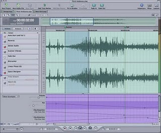
Soundtrack pro is a music composing and audio editing application, it has professional instrument loops and sound effects. We used Soundtrack pro to create our sound track to accompany our film. We chose the most suitable sounds from the array to best fit each scene and give the audience the right feel.
Livetype Question 4
Photoshop Question 4
Photoshop is a graphics editing programme, as an image editing programme, you can use photoshop to alter images like photos, downloaded icons and scanned artwork. Altering an image includes doing such things as changing the colours within an image, modifying the size and scale of an image., or putting one picture 'within' another. Alteration also includes technical modifications such as changing the mode of image compression from one type to another, or changing the number of bits used per pixel. But, aside from altering images, Photoshop has a vast array of tools that help you "create" images from scratch. On the web, you will often need to make custom icons, buttons, lines, balls or text art. Photoshop makes all of this excessively easy and fun. We used photoshop to create our film poster, the many tools available on Photoshop allowed our group to create the type of poster we wanted with the effect we felt right for our film.
Final Cut Express Question 4
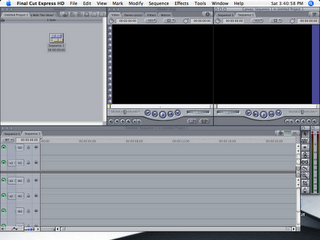
Final cut express is an editing application it is designed for advanced editing of digital video as well as high definition video. It has the ability to keyframe filters, motion path and opacity keyframing; as well as ripple, roll, slip, slide, and blade edits. Other features are picture in picture and split screen effects along with chroma key. Chroma key is a feature of final cut we used for our film.
Chroma keying is a technique for compositing two images or frames together in which a colour from one image is removed, revealing another image behind it. We used this technique to create our news report, we placed a green screen behind our actress as a colour it is consider to be least like skin tone, if our actress wore any green clothing she would have been replaced by the added image. For our added image we chose a spiralling world which we thought most resembled already established news reports so we thought it most appropriate.
Wednesday, 27 April 2011
The Softwares Question 4

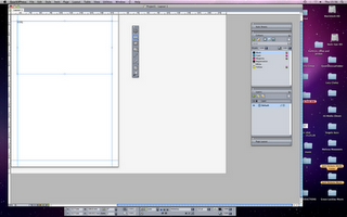
Quark Express is a software that we used to create our film review, the images are the logo for Quark Express and the other is Quark in use.
Quark express is a computer application used for creating and editing complex page layouts.QuarkXPress document contains text and graphics boxes. The boxes can be reshaped, layered, and given varying levels of transparency and text alignment. In addition to the basic functionality font, alignment, spacing, and colour, the package also provides its users with professional typesetting options like kerning, curving text along a line, and ligatures. The software allows both box positioning and graphic or text positioning within a box with an accuracy of one-thousandth of an inch.
It was a very useful software to use and with previous practice with the software easy to navigate for the creation of our film review; the software allowed us to recreate the plan we had of our review, and the idea we wanted to follow the theme of our film
Prezi Question 4

Prezi is a presentation application tool it uses a single canvas; text, images, videos and other presentation objects are placed on the infinite canvas and grouped together in frames. We used Prezi to present our storyboard in a different way, each scene was added to the prezi in a different way and users can zoom in and out in order to follow the story in a fun and different way.
Divshare Question 4
Divshare is a type of host were you can upload videos, photos and other files; you can host them for as long as you like and free of charge. The files can then be embed anywhere. All of our groups audio files are hosted on divshare; audio from our peer feedback and our treatment presentation with question and answer are the types of audio held on there. It is easy with them all in one place so the whole group can access them and then post them to there own blog.
Scribd Question 4
Scribd is a document sharing website, which allows users to post documents of various formats and embed them into a web page. My group posted our rough draft and final treatment, along with our prop list, review, shooting schedule, and script onto scribd. Using scribd made it easy for the group to all access the work and be able to post it on each of our blogs. It is simple to use all of the work is hosted in the same place.
Youtube Question 4

You tube is a new technology that is a free platform for exhibiting our work; we used it for posting our animatic; first draft of our film, and final film. By posting them on youtube they are easily embedded onto Blogger. Youtube also provides feedback from a wider audience as people are able to comment on the videos.
Blogger Question 4

The application Blogger is a new technology presentation tool; Blogger is the application that we used to host all of our research and planning, along with the ancillary tasks, and the evaluation.
Blogger is a very useful application and the most efficient way to present our work. The advantages of using Blogger are: Blogger caters for multimedia artefacts so our group was able to embed our film, animatic and other videos and we felt relevant to our research. Along with being able to upload images from photoshop, and google etc. It can be accessed all of the time and automatically saves our work, so there is no loss of work; it is also easy to edit using Blogger without having to re write a whole post if it were hand written. The information can be shared through Blogger as well, so my other group member could see my progress and like wise I could see theres.
Tuesday, 26 April 2011
Monday, 4 April 2011
Potential Movie review photos
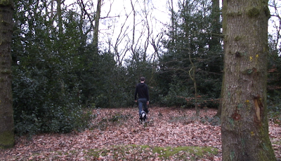
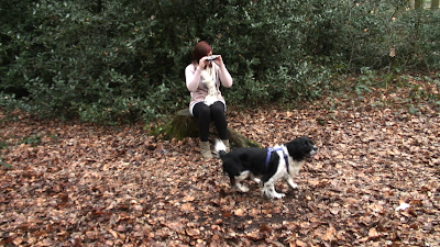
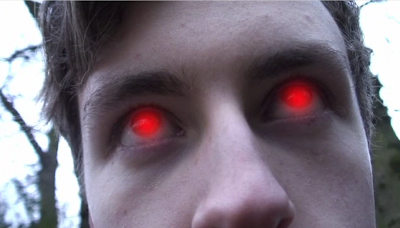 These are all stills from the film that we have decided not to use as they either give away too much about the film or aren't clear enough about the theme of the film. Chosing the photos for both the review and poster was a lot harder than I anticipated because we had to consider how our audience would read into the symbolisim of the photos and whether they gathered the correct understanding
 Saturday, 26 March 2011
Movie Review Research
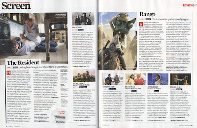
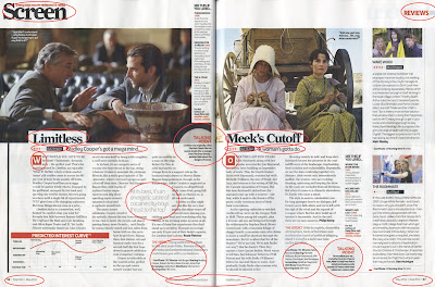 ions.
ions. 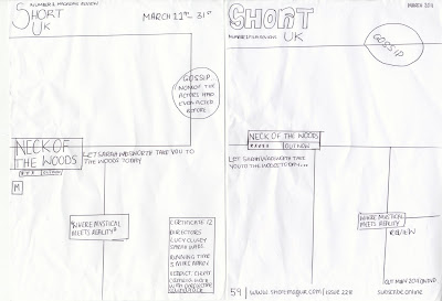 This is my 2 sketches of the kind of layout of the review, I found it a lot easier to sketch the reviews then I could use this as a reference when making the review on Quark.
Friday, 25 March 2011
Movie Poster
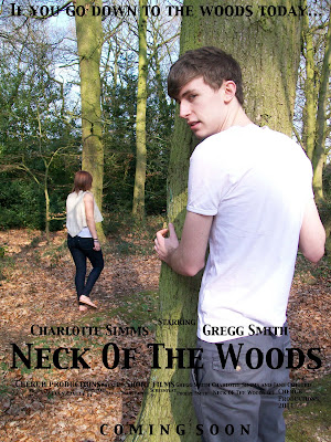
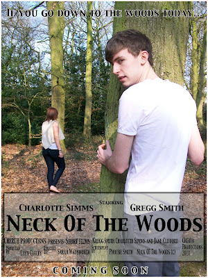 Above is our first draft of the film poster using the photo that the group decided we all liked. We have stuck to the style of our hand drawn plan with the positioning of the tagline, title and actors names and the theme of stalking in shown in the poster which is what we wanted to achieve. However we did notice the writing was a little hard to read so to combat this we added a grey box around the writing with a low opacity and added a stroke to the tagline and 'coming soon'. We then got our media class to look at the poster and tell us their opinions of the poster, any suggested changes and whether they get the themes we wanted to portray. We then recorded their views and suggested changes.
note: poster feedback starts at 5 minutes Above is the new and improved movie poster after considering some of the suggestions from the class feedback: Only keep the grey box around the neck of the woods and cast info: don't want to over do it Outline of the tagline and coming soon: added a white outline Needed to sort out the small writing underneath Neck Of The Woods The class really liked the photo but is it a bit too clear and more glossy magazine?
Thursday, 24 March 2011
Potential photos for film poster


Poster Draft
Wednesday, 23 March 2011
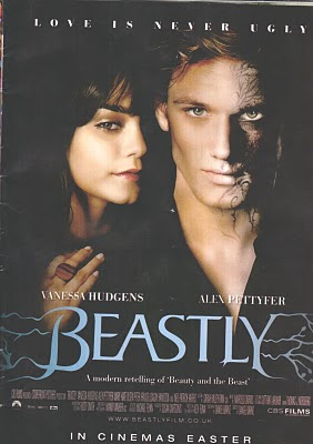
Magazine Poster Research
Tuesday, 22 March 2011
Ancillary task
The first task is a movie poster and the second is a film review.
I will document my progress whilst making the poster and review to show how we will make our end product.
Monday, 21 March 2011
Monday, 14 March 2011
Rough Cut Feedback
The writing in italics is the changes we are going to make to overcome the problems :)
General feedback:
Jerky pans in the living room from the T.V to Gregg and Charlotte walking to the house
Cut each shot shorter, the jerks start at the beginning of each shot.
The framing in the woods where Charlotte is taking the photos is good framing and the class seemed to really like it.
The class also really liked the flicker shots of the woods just before Charlottes killed.
The green screen isn't the greatest quality but still a good job.
They didn't like the way that it starts; J cut with a news graphic, jingle then newsreport
29 seconds: Fade through black newsreport to the titles. The sound is good and conventional of a newsreport. However the titles are too long- cut the length of the titles down.
53 seconds: The pan isn't smooth and the shot is a bit long. Cut the first part of the shot add some reaction shots.
Atmosphere sound isn't needed in the soundtrack- bit overdone.
1.16: The two reaction shots of Charlotte looking at the phone shows a continuity error, she's got the phone on the table, then the next shot is of the phone behind her ear. The solution is to add a shot before of a clock then in between the 2 shots of charl add another clock showing a couple of hours have passed.
1.50:When Charl goes home the shot is too long and the camera jerks. The jerks are only at the start so we will cut the shot so it's not so long.
2.09: The fridge shot for a 1/4 of a second theres a pause as she opens the fridge. Cut this by a couple of frames.
When Gregg appears in the window, needs to be a spin chilling moment, with a sound effect or a change in music as the music before gives away that its a thriller. Change the soundtrack so that it appears almost like a romantic, then when gregg is in the window, sudden change in music.
Another stinger when Gregg disappears from the fence. Sound effect.
Shorten the scene when Gregg appears behind the tree.
The scene where Charlotte and the dog walk into the woods is too long. Cut the shot at the end.
The shot of charl holding the camera before getting killed add a camera noise sound effect
News titles on each news report
Add an ident at the start.
Sunday, 13 March 2011
Thursday, 10 March 2011
Trouble with the moon
Our media teacher told us that to film a moon would be very difficult and to capture a moon involves a lot of specialist equipment. He then suggested buying a photo of a full moon to use in our film to solve the problem, in the end we ended up buying the photo of the full moon to use in our second draft.
Monday, 7 February 2011
Editing
- Final Cut: this will be to edit our film
- Soundtrack Pro: this will be used to do our soundtrack
- Live type: to do titles, also where the background from the new's report is from.
- YouTube: to host the end product
Saturday, 5 February 2011
Shooting on location: shoot 2
The second shoot was at the cafe, luckily it was really quiet so we weren't going to be disturbed by anyone. We did a few takes for each shot so we made sure we weren't an inconvenience and had to go back to reshoot.
Next we went to my house to film Charl coming back from the cafe, and then going to the woods with the dog (Casper). We had some difficulties keeping the pan up with casper pulling Charl to get to Gregg or trying to get to us, but after a few try's we finally got what we were looking for.
The woods shoot was our most successful, although not planned we made a few changes to the shoot there and then as they were opportunites that we couldn't miss! As the camera was rolling, Casper started to bark as he heard another dog, we managed to get a clip of him barking and wanted to use it in the film.
Friday, 4 February 2011
Shooting on location: shoot 1
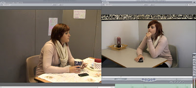 The left picture is the cafe set that we made, the second photo is a still from an actual cafe
 The second shoot was the news reports. We used one of our friends from our media class and again used the grey board with a red sheet over it. The camera was also set to manual mode which made it all out of focus, our newsreported didn't look like a news reporter and the whole thing looked really poor. We then decided that we would use a green screen after finding a background we liked on live type. Our other media teacher also said that she would be our newsreporter. Overall it looked a million times better with a green screen and was really interesting to make. To learn how to do it we watched a tutorial on YouTube which was really helpful and we did it on final cut.  The left was our first attempt at a news report, its unfocused and looks nothing like a news report. The right picture is our second attempt using green screen.
The next shoot was at Sarah house for the kitchen scene. This again was all out of focus as we didn't realise that the camera was set on manual and on the preview screen showed it as in focus. We then had to go back and reshoot this to improve the quality.
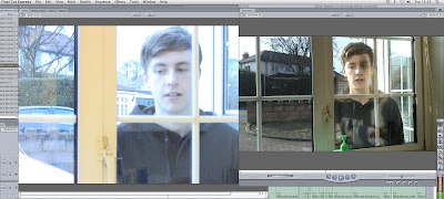 The left photo is the first attempt and is out of focus. The right photo is the second attempt.
Thursday, 3 February 2011
Preparing for the shoot
Firstly what are the problems going to be?
We looked at the weather reports to make sure the weather is okay to film outside, we didn't want it to rain as we were going to spend a lot of time filming in the woods.
The equ
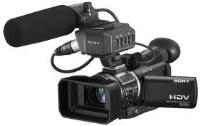 ipment we are going to need will be:
- Clapperboard
-Tripod
- HD tape
The camera work will probably be shared throughout the shoots, so we all participate and whilst one of us shoot, one of us will be in charge of the clapperboard and the other organising the actors.
Whoever is doing the camera work at the time will have to check the camera is charged enough, the framing is right and whether the lighting is okay.
Whoever is in charge of the clapperboard can help who is on the camera and help organise actors, check the costumes and make sure the props are there and ready to be used.
Whoever is organising actors will have to make sure they know what they have to do and whether they know their lines.
To organise the actors we have supplied them with, script, shooting schedule and a story list. Luckily Gregg can drive and is willing to drive us to to each of our locations so this means that we won't have any difficulty getting there.
Wednesday, 2 February 2011
Brand Identity
Visible elements of a brand (such as colors, design, logotype, name, symbol) that together identify and distinguish the brand in the consumers' mind.
Basically in terms of our film, the visible elements such as, colours that are commonly used, shapes that are related to our film for example a werewolf or symbols used are all incorprated into the design of our titles, as this place where all these elements come together.

Harry Potter is a good example, the font style is a gothic style which ties in with:
- The setting (almost all the buildings are gothic)
- The plot; mystical
The colours used also tie in with the gothic style and the convention of Gothic is stormy weather which is used in the background.
Tuesday, 1 February 2011
Title research
Our first step is to research some titles of a similar genre. Our genre is a thriller/mystical genre.
A film that is really similar to ours is The Wolfman:

These titles are very conventional, the black background is a gothic colour and the moon is a connected to werewolves as in full moons make the human turn into a werewolf.
When creating our titles we will incorparate colours related to the gothic theme and also elements of mystical thriller.
Our titles will contain:
-a dark background
- moon in the 'O'
- Gothic colours ; dark and gloomy
Film title examples from a similar genre:
The Village:
This film is a thriller and is similar to ours because the villagers fear something mystical in the woods:
28 Days Later:
Panic Room:
Monday, 31 January 2011
Shooting Schedule
This is our shooting schedule, it will be given to all the group members (Sarah and Phoebe) and to our actors, it will tell everyone where and when they should be to film and they can also check the dates to make sure they make no plans for the times we have planned to go and shoot. It also can be checked against the prop list and costume list to show what they need to where and what props we need to supply.
Props list
A props list is really important on and off shoot. It allows us to see the things we will need to supply and get for the shoot and when we need them. It lets us work out where will get them from too. Our props aren't going to be hard to source as Sarah already has the camera and I have the dog. The rest are things that will be easy to gather.
Costume
Charlotte the main character is the innocent victim whereas Gregg is the stalker/killer. Both complete oposites which I feel should be emphasised in costume.
Charlotte as I said is the victim, and therefore she should be portrayed as innocent and vunerable however, I don't want the symbolism to be really in your face and I want to portray her as still girly, which will suggest she is weaker than Gregg.
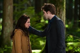
An example of a female in a similar film is the character Bella Swan in Twilight.
She dresses like a typical teenager but through the use of light clothing portrays a sense of symbolism.
We have decided that Charl should wear a light coloured cardigan, which she already has, which is a pinkish colour. This will portray her as girlie but the white top she will where will show her innocence. Gregg on the other had will wear dark clothing for example a black hoody to show he is dangerous.
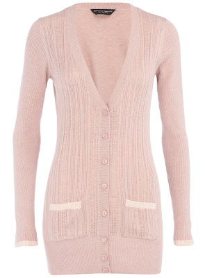

This is an example of the kind of hoody that Gregg will wear, the dark colour is symbolic of evil.
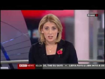
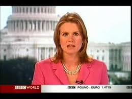
For the newsreader it's important to look at what kind of clothing they wear.
I researched BBC news female readers and from the reports i've seen on the t.v and the pictures i've seen, i've found that generally they are dressed smart, normally in a suit.
