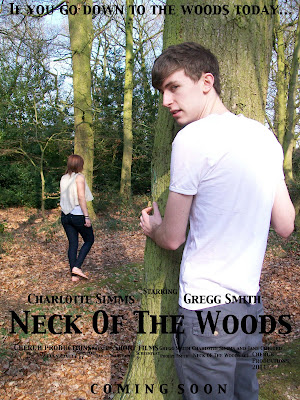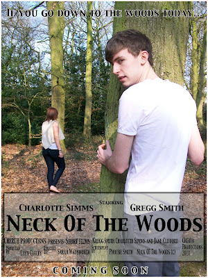
 Above is our first draft of the film poster using the photo that the group decided we all liked. We have stuck to the style of our hand drawn plan with the positioning of the tagline, title and actors names and the theme of stalking in shown in the poster which is what we wanted to achieve. However we did notice the writing was a little hard to read so to combat this we added a grey box around the writing with a low opacity and added a stroke to the tagline and 'coming soon'. We then got our media class to look at the poster and tell us their opinions of the poster, any suggested changes and whether they get the themes we wanted to portray. We then recorded their views and suggested changes.
note: poster feedback starts at 5 minutes Above is the new and improved movie poster after considering some of the suggestions from the class feedback: Only keep the grey box around the neck of the woods and cast info: don't want to over do it Outline of the tagline and coming soon: added a white outline Needed to sort out the small writing underneath Neck Of The Woods The class really liked the photo but is it a bit too clear and more glossy magazine?
No comments:
Post a Comment