ions.
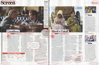
This is my 2 sketches of the kind of layout of the review, I found it a lot easier to sketch the reviews then I could use this as a reference when making the review on Quark.
Our final product at the end of A2 Media will be a 5 minute short film. My blog will document the work and evidence that is needed for our film to be as successful as possible.
ions.
This is my 2 sketches of the kind of layout of the review, I found it a lot easier to sketch the reviews then I could use this as a reference when making the review on Quark.
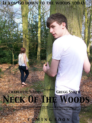
Above is our first draft of the film poster using the photo that the group decided we all liked. We have stuck to the style of our hand drawn plan with the positioning of the tagline, title and actors names and the theme of stalking in shown in the poster which is what we wanted to achieve. However we did notice the writing was a little hard to read so to combat this we added a grey box around the writing with a low opacity and added a stroke to the tagline and 'coming soon'. We then got our media class to look at the poster and tell us their opinions of the poster, any suggested changes and whether they get the themes we wanted to portray. We then recorded their views and suggested changes.
The writing in italics is the changes we are going to make to overcome the problems :)
General feedback:
Jerky pans in the living room from the T.V to Gregg and Charlotte walking to the house
Cut each shot shorter, the jerks start at the beginning of each shot.
The framing in the woods where Charlotte is taking the photos is good framing and the class seemed to really like it.
The class also really liked the flicker shots of the woods just before Charlottes killed.
The green screen isn't the greatest quality but still a good job.
They didn't like the way that it starts; J cut with a news graphic, jingle then newsreport
29 seconds: Fade through black newsreport to the titles. The sound is good and conventional of a newsreport. However the titles are too long- cut the length of the titles down.
53 seconds: The pan isn't smooth and the shot is a bit long. Cut the first part of the shot add some reaction shots.
Atmosphere sound isn't needed in the soundtrack- bit overdone.
1.16: The two reaction shots of Charlotte looking at the phone shows a continuity error, she's got the phone on the table, then the next shot is of the phone behind her ear. The solution is to add a shot before of a clock then in between the 2 shots of charl add another clock showing a couple of hours have passed.
1.50:When Charl goes home the shot is too long and the camera jerks. The jerks are only at the start so we will cut the shot so it's not so long.
2.09: The fridge shot for a 1/4 of a second theres a pause as she opens the fridge. Cut this by a couple of frames.
When Gregg appears in the window, needs to be a spin chilling moment, with a sound effect or a change in music as the music before gives away that its a thriller. Change the soundtrack so that it appears almost like a romantic, then when gregg is in the window, sudden change in music.
Another stinger when Gregg disappears from the fence. Sound effect.
Shorten the scene when Gregg appears behind the tree.
The scene where Charlotte and the dog walk into the woods is too long. Cut the shot at the end.
The shot of charl holding the camera before getting killed add a camera noise sound effect
News titles on each news report
Add an ident at the start.
The left picture is the cafe set that we made, the second photo is a still from an actual cafe The second shoot was the news reports. We used one of our friends from our media class and again used the grey board with a red sheet over it. The camera was also set to manual mode which made it all out of focus, our newsreported didn't look like a news reporter and the whole thing looked really poor. We then decided that we would use a green screen after finding a background we liked on live type. Our other media teacher also said that she would be our newsreporter. Overall it looked a million times better with a green screen and was really interesting to make. To learn how to do it we watched a tutorial on YouTube which was really helpful and we did it on final cut.
The left was our first attempt at a news report, its unfocused and looks nothing like a news report. The right picture is our second attempt using green screen.
The next shoot was at Sarah house for the kitchen scene. This again was all out of focus as we didn't realise that the camera was set on manual and on the preview screen showed it as in focus. We then had to go back and reshoot this to improve the quality.
The left photo is the first attempt and is out of focus. The right photo is the second attempt.
ipment we are going to need will be:
Harry Potter is a good example, the font style is a gothic style which ties in with:
- The setting (almost all the buildings are gothic)
- The plot; mystical
The colours used also tie in with the gothic style and the convention of Gothic is stormy weather which is used in the background.

These titles are very conventional, the black background is a gothic colour and the moon is a connected to werewolves as in full moons make the human turn into a werewolf.
When creating our titles we will incorparate colours related to the gothic theme and also elements of mystical thriller.
Our titles will contain:
-a dark background
- moon in the 'O'
- Gothic colours ; dark and gloomy
Film title examples from a similar genre:
The Village:
This film is a thriller and is similar to ours because the villagers fear something mystical in the woods:
28 Days Later:


After discussing our animatic with the class it was obvious that we should make some changes. We asked questions after the class watched the animatic and their answers were really valuable.
Is the meaning of the film apparent to the viewer?
The howl + fullmoon suggests that Gregg has turned into a werewolf.
Not so clear when that its a werewolf because the killing happens in daylight; challenging conventions in the day example of a film that has a werewolf in the day is twilight- werewolf in day.
Chat on screen- animatic didn't show it was typed up on screen, suggests would be a bit boring? reaction shots?
The titles are too long, the titles aren't very clear to how the moon fits in with them.
Is framing good and could it be improved?
In the kitchen scene- need to put him on the outside of the window.
Does the shot of the moon zoom out? Should make it more clear that it's a tilt down.
Have we chosen appropriate shot distances? if not are they appropriate?
A lot of long shots? maybe a few reaction shots to break up the shots.
Polaroid picture- white background- just on animatic will be in woods
Are transions used appropriately?
suggested that we use multiple shots of pictures of the werewolf with good transitions
Is dialouge used appropriately if not why? Does the soundtrack support the visual images?
Lack of effects like doors and footsteps for just the animatic like leaves/ woods ect
Suggested improvements:
Soundtrack-boring
Titles in livetype
Make the change of day more obvious
Chilling sound when Gregg appears in the window
Is the film an appropriate length?
Think the film won't be very long, and the shots will be too long to make up length which will result in being boring.
After looking at the suggestions and the feedback we decided to make a few changes, this impacted on a change in the script. The next post will be our updated script.

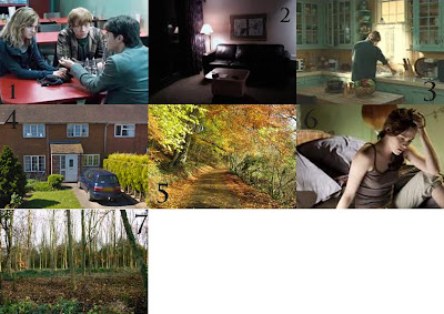
1) Is a cafe scene from the latest Harry Potter film, we are planning on making our own cafe scene and hope to create something similar. There are the tables, the till section of the cafe and all the necessary props to create an authentic scene
2) Is an example of a dark living room that will be similar to ours. The darkness will give a Gothic effect.
3) This is a kitchen from a scene in Marley and Me. Our kitchen will need to be a similar if not smaller in size so that we can film comfortably.
4) This is actually my house which has been the decided location for the outside shots, it's simple to get to, the street it's on is very quiet and has the drive we need for her to walk up.
5) This is an example of a wooded path. The female victim will be walking up wooded paths as she is watched by the werewolf.
6) In our film a bedroom will be needed for where the female victim will be. This is a still from Twilight a film which is very similar to ours, the bedroom is typically of a teenagers.
7) This is a photo of a random set of woods, they are very similar to the ones we will be using.
Final Location Choices:
- Lounge; we will be using the lounge of one of our actors, Charls. It's modern yet with little natural light, which produces a dark effect.
- Cafe; We plan on making our own cafe set
- Quiet street; the street outside of my house
- Kitchen; Sarah's kitchen, it's bigger than mine and the window is easier to get the shot of Gregg
- Woods; there are some public woods near my house within walking distance which are usually very quiet in the daytime.

I found this short really interesting. What I liked the most was the titles, as they appeared through an actual black hole. The fit the movie and looked really effective. I also like the fact that there isn't any dialogue or music but the film is still good quality.
Strangers